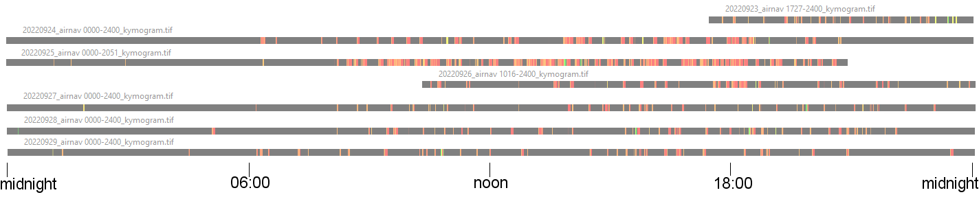
A few conclusions based on looking at one week of flight data over lower Westchester.
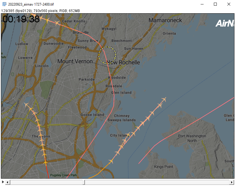
The map shows the area being measured. The white circle is drawn around the Glenwood Lake neighborhood.
A similar circle of any size could be placed anywhere on the map to take measurements there for comparison to Glenwood Lake's activity.
Any time a flight path intersects the edge of the white circle, it is registered as a horizontal line on the strips below.
Red are the lowest flights. Orange higher. Yellow and green highest. The higher planes are not as loud but seem to rumble longer. Based on data from another website, the higher planes originate at EWR, JFK, or elsewhere. Also, they tend to have more linear flight paths.
Each strip runs from midnight at the left to midnight at the right. (Some days only have partial data.)
Sunday, September 25 was loud. Nonstop low air traffic.
Tuesday, Sept 27 I was home and it didn't seem nearly as bad.
The evening of the 29th seemed unusually quiet. There were long stretches of quiet.
Looking at the kymogram data, the frequencies of flights agrees with what I thought based on noise.
This will look better on a wide screen greater than 1000 pixels, not on a vertical phone screen.
Not all flights are large planes as this methodology does not discriminate paths based on type of aircraft; some small prop planes and helicopters are included.
Looking at the movies additionaly shows flight patterns. I will add examples later.
For one example of a flight pattern, see a preliminary analysis of Sept 23.
A more common flight pattern is planes to the west of GL headed NE that turn S after passing Webster School and then turn SW headed to LGA. There is a similar loop over Long Island and the coast of New Rochelle. I will post pictures later.