Must read paper: https://www.ncbi.nlm.nih.gov/pmc/articles/PMC4114110/
Douglas W. Cromey. Avoiding Twisted Pixels: Ethical Guidelines for the Appropriate Use and Manipulation of Scientific Digital Images. Sci Eng Ethics. 2010 Dec; 16(4): 639–667. PMID: 20567932 doi: [10.1007/s11948-010-9201-y]
Without much explanation, here are examples of a single dataset shown in different ways to illustrate that intensity saturation is bad. At the bottom of this page is a brief explanation of how to show bright and dim signal in the same image while preserving underlying raw data for proper analysis.
A common reason people saturate their images is to see very weak signal next to bright signal. The correct thing to do is use more than 8 bits for a wide dynamic range, collect low noise images, and use gamma, sqrt, log scale, or local contrast enhancement to show the images and explain this in the text. But keep the raw data for intensity measurements that reflect the actual numbers of molecules in different locations.
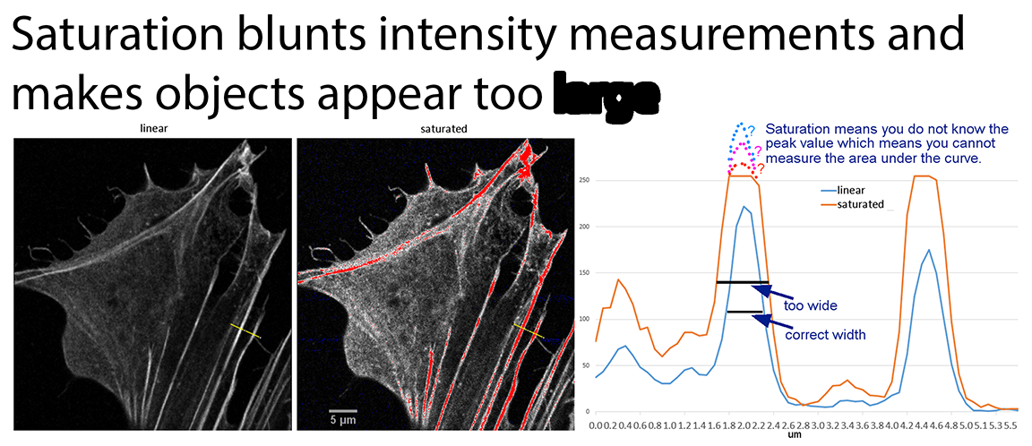
The problem:
Let's look at dynamic range. ImageJ 1.51 used for all adjustments and measurements.
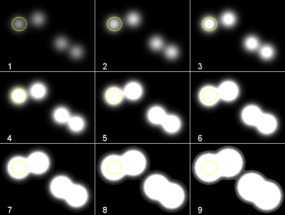
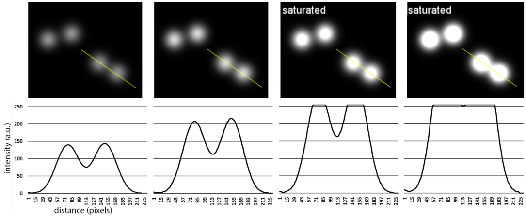
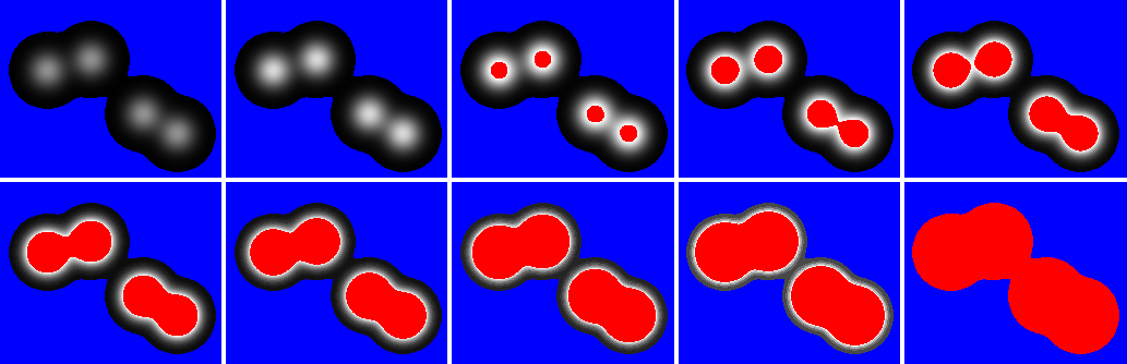
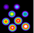
The following image has 8 spots. The dimmest spot has a max intensity approx 14 and the brightest one 29600. These extremes cannot be displayed on a linear scale. With a linear range to see the brightest spot without saturating, where are the least intense spots?
Adjusting the original data collection or the look up table to see the weakest spots blows out the bright ones.
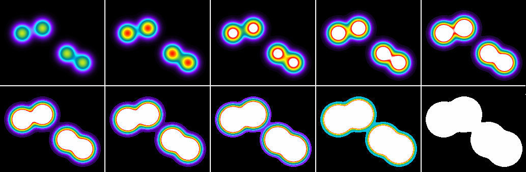
Using a color LUT (look up table) and rescaling from zero to the brightest pixel value helps show subtle differences, but doesn't reveal the weakest labeled spots.
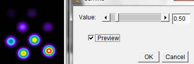
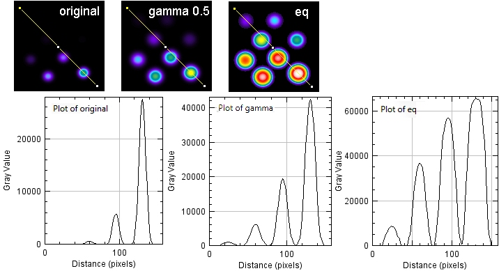
Applying a gamma curve permanently changes the underlying values, but shows all the objects without saturating any. Yes, the bright values are compressed, but not saturated. Say something like, "Because of wide dynamic range in original data, image is shown with a gamma of 0.5 applied in ImageJ."
Equalizing the contrast is also effective, but each image is equalized based on its own dynamic range, so side-by-side comparisons of different conditions may not have relative intensities preserved. A way around this is to make a composite figure of all conditions in the original bit depth and apply the eq at the end. But another problem remains; sizes of objects may appear to vary based on the redistribution of intensities.
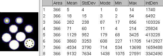
Regardless how you scale the images to show the features, the raw data measurements are the same. The yellow circle was centered over each spot and the numbers recorded.
Because there are sparse bright objects on a dark background, the equalization makes the shape of the points look too blunt. Gamma adjustment the better choice for this type of image.
Click here for biological example.
The LUT on the beadsis below and packaged in "Useful Collection of Macros" at http://microscopynotes.com/imagej/
//===========================================
macro "Recolor with ratio LUT [F6]"{
  requires ('1.38f');
  makeFavoriteAIFpseudocolorLUT();
}

//===========================================
function makeFavoriteAIFpseudocolorLUT(){
  red = newArray(0,4,8,12,16,20,24,28,32,36,40,44,48,52,56,60,64,68,72,76,80,84,88,92,96,100,104,108,112,116,120,124,128,128,128,128,128,128,128,128,128,128,128,128,128,128,128,128,128,120,112,104,96,88,80,72,64,56,48,40,32,24,16,8,0,0,0,0,0,0,0,0,0,0,0,0,0,0,0,0,0,0,0,0,0,0,0,0,0,0,0,0,0,0,0,0,0,3,7,11,15,19,23,27,31,35,39,43,47,51,55,59,63,67,71,75,79,83,87,91,95,99,103,107,111,115,119,123,127,131,135,139,143,147,151,155,159,163,167,171,175,179,183,187,191,195,199,203,207,211,215,219,223,227,231,235,239,243,247,251,255,255,255,255,255,255,255,255,255,255,255,255,255,255,255,255,255,255,255,255,255,255,255,255,255,255,255,255,255,255,255,255,255,255,255,255,255,255,255,255,255,255,255,255,255,255,255,255,255,255,255,255,255,255,255,255,255,255,255,255,255,255,255,255,255,255,255,255,255,255,255,255,255,255,255,255,255,255,255,255,255,255,255,255,255,255,255,255,255,255,255,255,255,255,255,255);
  green = newArray(0,1,2,3,4,5,6,7,8,9,10,9,9,8,8,7,7,6,6,5,5,5,4,4,3,3,2,2,1,1,0,0,0,7,15,23,31,39,47,55,63,71,79,87,95,103,111,119,127,135,143,151,159,167,175,183,191,199,207,215,223,231,239,247,255,247,239,231,223,215,207,199,191,183,175,167,159,151,143,135,128,129,131,132,134,135,137,139,140,142,143,145,147,148,150,151,153,154,156,158,159,161,162,164,166,167,169,170,172,174,175,177,178,180,181,183,185,186,188,189,191,193,194,196,197,199,201,202,204,205,207,208,210,212,213,215,216,218,220,221,223,224,226,228,229,231,232,234,235,237,239,240,242,243,245,247,248,250,251,253,255,251,247,243,239,235,231,227,223,219,215,211,207,203,199,195,191,187,183,179,175,171,167,163,159,155,151,147,143,139,135,131,127,123,119,115,111,107,103,99,95,91,87,83,79,75,71,67,63,59,55,51,47,43,39,35,31,27,23,19,15,11,7,3,0,8,16,24,32,41,49,57,65,74,82,90,98,106,115,123,131,139,148,156,164,172,180,189,197,205,213,222,230,238,246,254);
  blue = newArray(0,7,15,23,31,39,47,55,63,71,79,87,95,103,111,119,127,135,143,151,159,167,175,183,191,199,207,215,223,231,239,247,255,255,255,255,255,255,255,255,255,255,255,255,255,255,255,255,255,255,255,255,255,255,255,255,255,255,255,255,255,255,255,255,255,251,247,243,239,235,231,227,223,219,215,211,207,203,199,195,191,187,183,179,175,171,167,163,159,155,151,147,143,139,135,131,128,126,124,122,120,118,116,114,112,110,108,106,104,102,100,98,96,94,92,90,88,86,84,82,80,78,76,74,72,70,68,66,64,62,60,58,56,54,52,50,48,46,44,42,40,38,36,34,32,30,28,26,24,22,20,18,16,14,12,10,8,6,4,2,0,0,0,0,0,0,0,0,0,0,0,0,0,0,0,0,0,0,0,0,0,0,0,0,0,0,0,0,0,0,0,0,0,0,0,0,0,0,0,0,0,0,0,0,0,0,0,0,0,0,0,0,0,0,0,0,0,0,0,0,0,0,0,0,0,8,16,24,32,41,49,57,65,74,82,90,98,106,115,123,131,139,148,156,164,172,180,189,197,205,213,222,230,238,246,254);
  setLut(red, green, blue);
}
A tangent: back in the day we used to make sure that prints for publication never went to black. Anything within 10% of black would be lost in the halftone process and inking for printing. If there were any subtle low intensity values, we would make sure the print went only to dark gray, never to black. Then, with the introduction of the curves function in Photoshop and gamma in other software (NIH-Image and Image1-AT, the predecessor of Metamorph, for instance), we could boost the weak intensities so they would be printed. We said that contrast was adjusted so you can see what is there. We understood what we were doing and explained that it was done and why it was done; many people had no idea how film and photo chemistry worked and thought there was some sort of ground truth in photography. Film and photo paper have non-linear responses which can be further altered with the liquid chemistry. Some people shout, image manipulation!!! But this is showing what is there, turning on the lights in a dark room. It is showing existing phenomena.
All quantification and original analysis must be performed on the underlying raw data, the original linear response data, the data that should have no negative offset clipping to black and no saturation at the high end.
Did anyone even read this far?