
A brief introduction to the kymogram as a tool for counting flights and assessing their regularity and frequency.
At left is a single frame of a time lapse sequence (frame 243 at 9:53 pm 2022-09-23). At right is the movie resliced in time through the blue box overlaid on the single frame. This of the movie being cropped in XY where the blue box is and then resampled so X axis stays the same and Time becomes the Y axis. Therefore, 5:43 PM is at the top and 9:53 PM is at the bottom. Each dark horizontal line is where a plane passes through the selected region. This makes it easy to see events.
The following version shows the kymogram only for the immediate Glenwood Lake neighborhood centered on the are between the lake and Webster School.
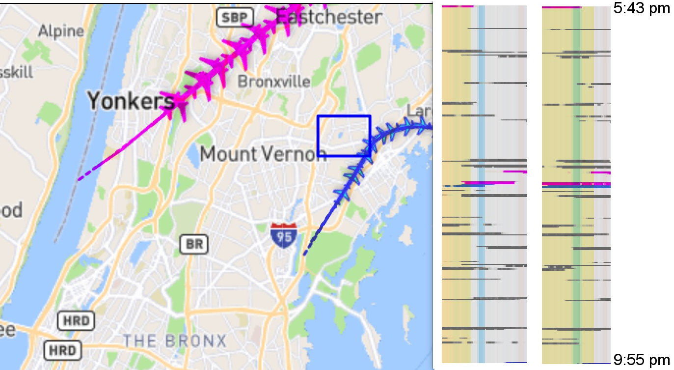
The kymogram on the left is showing a reslice along the X axis and the one on the right is along the Y axis. This makes sure that planes flying precisely NS or EW are not lost. (Not shown, these could be overlaid for a single result.) A quick (and imprecise) count looks like 28 planes over 4 hours. This is an average of 7 planes per hour. But some periods have none and then other periods have higher frequency. Caveat: this is only one evening of data.
Also, how does this relate to neighboring areas? We could measure there too. This would begin to answer questions about fairness of our share of airplane noise.
By the way, the flights coming from the south are mostly takeoffs from LGA. And the different colors represent different airports of origin. There is a key at https://webtrak.emsbk.com/panynj4
The movie is displayed at 2 frames per second. Each frame represents 1 minute. The full length of the movie is a few frames over 4 hours beginning at 5:43 pm 2022-09-23 and Glenwood Lake neighborhood is in the blue circle.

The following kymogram shows data from 24 September 2022 beginning at midnight through the day until 10:00 PM from within the red box marked on the map to the lower right.
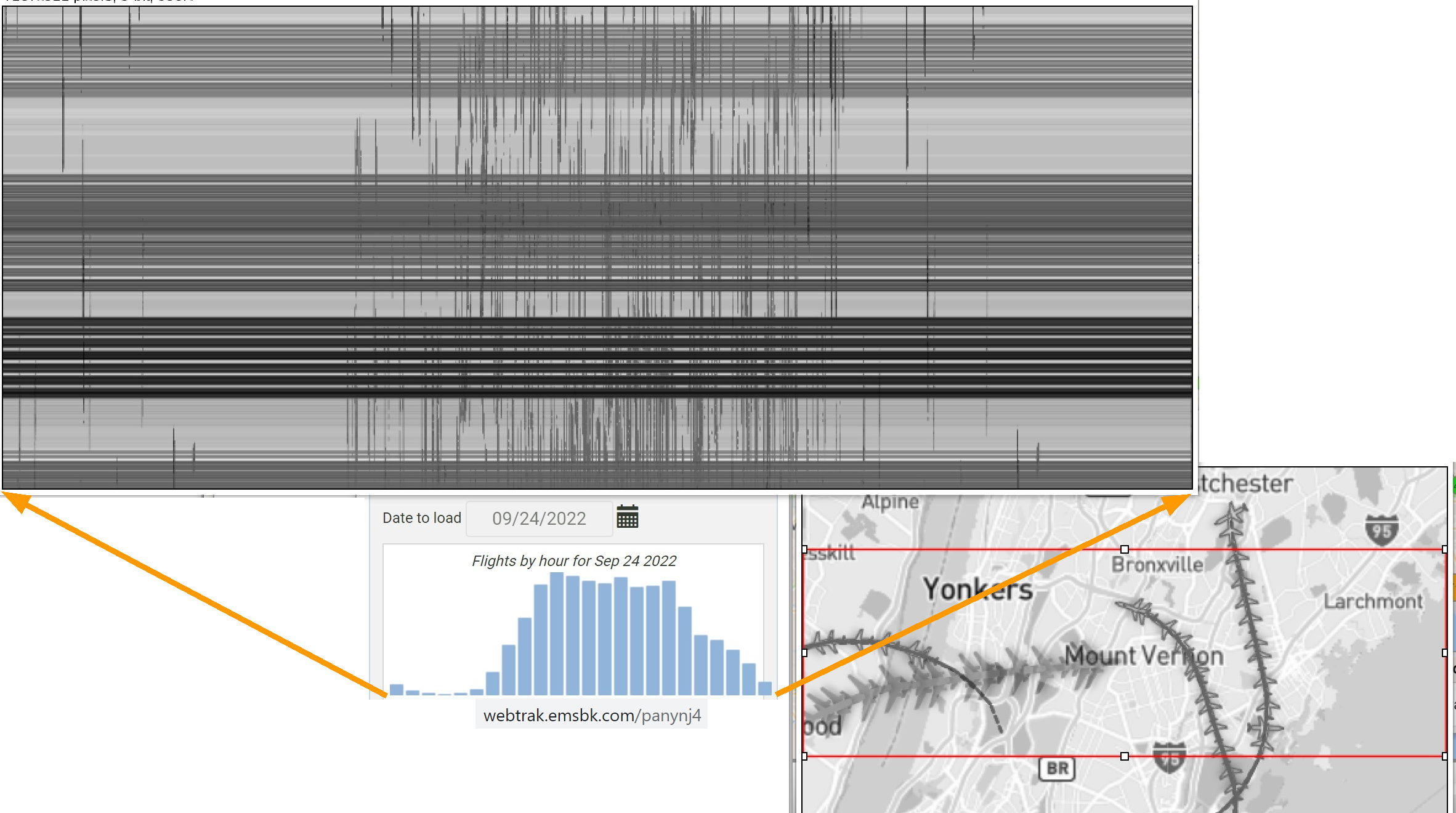
The graph with the blue bars shows the data source's count of flights through the day for the entire region. The orange arrows mark how to align the kymogram with the blue bar histogram.